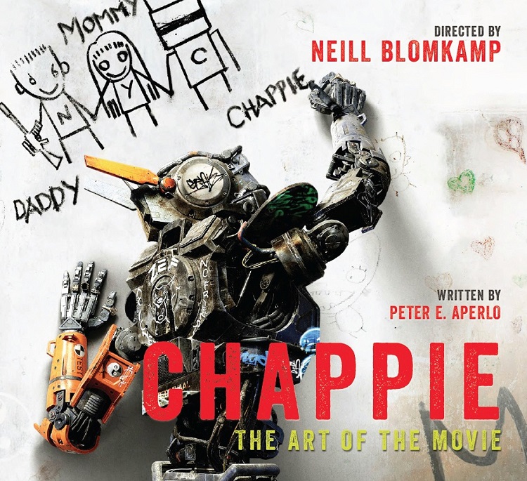
A few weeks ago, Chappie, writer/director Neill Blomkamp’s latest film, arrived in theaters to mixed reviews. A few days ago, Chappie: The Art of the Movie arrived on my doorstep in a similar fashion. Taking inspiration from the creator’s short film “Tetra Vaal,” Chappie contains all the typical elements of a Blomkamp film: gritty science fiction grounded in a hard reality, ultra-violent action, and a sharp satirical wit. Oh yeah, and Sharlto Copley too.
Anyway, on to the book. Big hardcover coffee-table art books are pretty much a no-brainer, especially when they deal with robots, and if you’re reading this review, I’m going to go out on a limb and assume you’re into pre-production sketches, set designs, and sweet-looking robots, all of which are featured in this book.
Neill Blomkamp’s films share a unique vision of a future that looks like it’s right around the corner: lived in to the point of being worn out and realistic enough that a robot with a developing self awareness doesn’t seem too out of the ordinary. With Chappie: The Art of the Movie, author Peter E. Aperlo takes us behind the scenes of the film, not only detailing how the look of each location and character (whether they be human or robot) came to be, but also how the characters themselves took root and grew in Blomkamp’s fertile imagination.
The book is broken into four self-explanatory chapters: The Meat, The Metal, Locations, Vehicles, and Gear. There are also a few extras like a foreward and an introduction, acknowledgements and that sort of thing. It’s easy to navigate; the pictures are big, bold, and look great, and the text provides a healthy amount of information on whatever it is you’re reading about. But that’s where this review gets a bit challenging to write. It’s not that Chappie: The Art of the Movie doesn’t give you it’s all; it’s just that it doesn’t seem to have that much to give.
A big part of the reason I love this type of book, and the reason I called it a “no-brainer” is that I love to see the many different design elements that went into a final product. Using Star Wars as an example (of course), I know I’m not the only one who has thrilled to pictures of Yoda that resembled a cross between Papa Smurf and David the Gnome, or the samurai and Flash Gordon influences that went into Darth Vader, the Stormtroopers, and Luke Skywalker. Some of those images bear little to no resemblance to what we saw on the big screen and a few of them have us wondering why they weren’t given the stamp of approval instead of the ones we did see. The joy of a big, fat, hardcover book filled with pre-production designs is seeing how much these things evolved before public consumption.
But with Chappie, it seems as though the design of these robots only went through a revision or two before they got to the final version. And hey, that’s cool – sometimes you get it right on the first (or second) try. In the case of Chappie himself, the design harkens all the way back to the “Tetra Vaal” short from 2004, with very little changes being made before the version we see in the 2015 film. So while it’s cool to see the (very) few different versions of the character from front, back, and side angles…it’s just a little disappointing because you can’t help but want more.
It’s sort of like seeing a book about the design of the Smurfs – here’s a Smurf. Now here’s the exact same Smurf with glasses. Now here’s the exact same Smurf with a cake. Oh wait, this one has a tattoo! Yeah, it’s cool, and trust me when I say that I love the Smurfs; but at the end of the day, it’s a bunch of pictures of the same Smurf. And as cool as he looks, there are only so many times I can look at Chappie’s head from a different point of view, or with a bullet hole in it or a bent antennae.
As far as the locations go, it reminds me a bit of a familiar rhyme you may have seen scrawled on a bathroom stall. I believe it begins with “Here I sit, all broken hearted…” and I’m sure you remember the rest. It might sound really cool to imagine what a factory that builds robots looks like, but remember a few paragraphs ago when I talked about the realism in the design of Neill Blomkamp’s films? Yeah, that factory that builds robots just looks like…well, pretty much like any other factory. And the office, where the CEO of the robot factory makes all of her decisions? Sorry, it’s just an office. Go into your boss’ office and put a little robot statue on the desk and you get the idea. Here I sit, all broken hearted…
At the end of the day, Chappie: The Art of the Movie looks good and definitely provides a nice dose of insight into the film, which is what it is supposed to do. I certainly didn’t hate it, but there just isn’t a lot of replay value between the covers. It’s a pretty book, and a well-written one, but at $34.95, it’s probably more expensive than the Blu-ray will be upon release, and you’ll definitely spend more time watching the extras than you will flipping through these pages.