Let’s get this out of the way right here at the beginning: I haven’t seen Justice League. Nor do I particularly want to see Justice League. Despite being a lifelong fan of comic books and superheroes, I’m not quite sold on Warner Brothers’ vision for the DC characters (with the exception of Wonder Woman, which was absolutely stunning), and it’s nearly impossible to avoid, or remain unaffected by the flurry of bad press the film has gotten from the often unfair online media prior to its release. But none of those reasons speak to why I remain uninterested in the film. I do my best to let a film, rather than internet rumor or even critical review, speak for itself. No, the reason I wasn’t all that keen on seeing Justice League was that it just didn’t look very good.
And I don’t think it necessarily looked very bad either. The trailers just didn’t really grab me – the word “meh” comes to mind. I’m a man who has to budget his time and as much as I love superheroes, there’s a glut of them right now. Long gone are the days of youth when I watched any and every comic-related film simply because it was all we had. These days, I can pick and choose and if something doesn’t tickle my fancy, I don’t feel compelled to see it just because.
But none of that should affect my review of Justice League: the Art of the Film, right? Well… therein lies the challenge. Because a big part of what turned me off of the movie was the look. Every time I saw a Justice League trailer, I was baffled by the murky quality the film seemed to possess. It was as though everything was viewed through two filters: one red and one brown. It looked like I was watching a movie trailer through a dirty windshield, underwater in a swamp. Batman was still trapped in an all-black suit that feels like a product of a previous era and the fastest man alive wore a suit of armor that looked like it would slow him down to a crawl. The less said about Cyborg the better. Nothing about the movie looked fun or exciting or super. So why in the world would I want to review a big ol’ coffee table book depicting the creation of a film that didn’t really appeal to me?
Because I love big ol’ coffee table books about art and design, that’s why. I love big pages and big pictures. And because a lot of folks worked really hard on those designs and I was hoping to glean some insight into whatever it was that informed their choices. And maybe I’d discover something within this giant tome that would not only enlighten me, but possibly even change my mind about seeing the film? And also because I’ve checked out a few of Titan Books’ big ol’ coffee table books featuring behind-the-scenes art from science-fiction films and they rarely disappoint. So why not give it a shot?
Anyway, there’s my long-winded, fair-warning, full-disclosure intro. At this point, you probably either think I’m biased or just deluding myself into thinking I’m open minded. Let’s dispense with the pleasantries and get to the meat and potatoes of the review.
First of all, the book is big and heavy. So if you’re checking boxes for big ol’ coffee-table art book requirements, go ahead and use a Sharpie marker on those ones. Upon opening the book, I was struck by two things: one, every page is full of gigantic images from the film. There are no borders and these pictures take up the full page, threatening to spill right off. The second thing I noticed is that the book smells really bad. Like, whatever chemical process was used to print these stunning images, it’s not pleasing to the olfactory senses. Seriously, I know that’s a weird thing to put in a book review, but I felt like I walked into a perfume store and everyone was trying on everything all at once. But the longer I had the book and flipped through the pages, the smell faded somewhat and I presume that over time and continued perusal, it would dissipate entirely. I hope so, anyway.
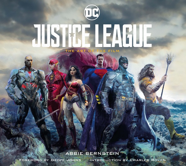
So, after a couple of intros, the book is broken into chapters which sort of seem to tell the story of the film, or at least set the stage so you know what it’s all about. As we weave our way through the basics of the film, we are introduced to a variety of characters and settings: Themiscyra, Atlantis, the Mother Boxes, Bruce Wayne’s car, Aquaman’s armor, and so on and so forth. There’s some pretty impressive close-up shots of the individual Justice Leaguer’s costumes that show the level of detail that went into making them. The Flash’s weird, cobbled-together armor shows signs of wear and tear from all the running, and Aquaman’s armor is insanely ornate. Each uniform has its own unique texture that speaks to the character’s personality and style and alongside the images from the film are short little blurbs from the designers about how they approached each costume, vehicle, or set piece. There are even quotes from the actors about their characters’ motivations as well as their mindset while portraying them.
But here’s the thing: the best parts of this book are the shots of actors, sets, and props from the film. They’re big and bold and beautful, bursting off the page. But the actual art of the film doesn’t even seem to make up the bulk of the book. I understand that when dealing with a film of this size, with this many characters, it’s not likely that we’ll see each and every cast-off design or piece of concept art that went into the finished product of Aquaman’s gauntlets or Batman’s shoulder pads, but it feels like a more accurate title for the book would be “Justice League: pictures from the movie accompanied by one or two paintings of the finished product”. I kind of felt like I was reading a picture book from the movie, like the Star Wars ones I got from the libarary when I was a kid. And maybe that was the intention and I misunderstood what the book was supposed to be offering. And that’s cool! But as beautiful as some of the art was and as eye-catching as the layouts are, I didn’t feel like I got the “invaluable insight” the back cover promised. It looks pretty, but it never felt like I was getting something special that couldn’t already be found on the Blu-ray extras or Justice League Facebook page. Even the blurbs from the actors and designers are fairly generic and feel like soundbites we’ve likely already read online or heard on some red carpet somewhere.
All told, Justice League: The Art of the Film is a gigantic and very attractive big ol’ coffee table book that just lacks that certain je ne sais quoi that makes it a must have for my bookshelf. And perhaps that certain something is just “a movie that looks better than this one”? Make no mistake: the folks at Titan Books know how to put together a nice-looking product, but I guess you were right when you said that my bias against the film would taint my view of the book. Or did I say that? Anyway, as nice as this book looks, it still looks like the Justice League movie, which still doesn’t look very good to me. And while I will gladly admit that the book did excite me more than any of the Justice League trailers (because it is a big ol’ coffee table book, after all), I still don’t really feel like I gained any more insight into what informed the creators to make their decisions, or was left wanting to flip through it again. But if you did like the way the movie looked – heck, give this a shot. You’ll probably like it more than I did.