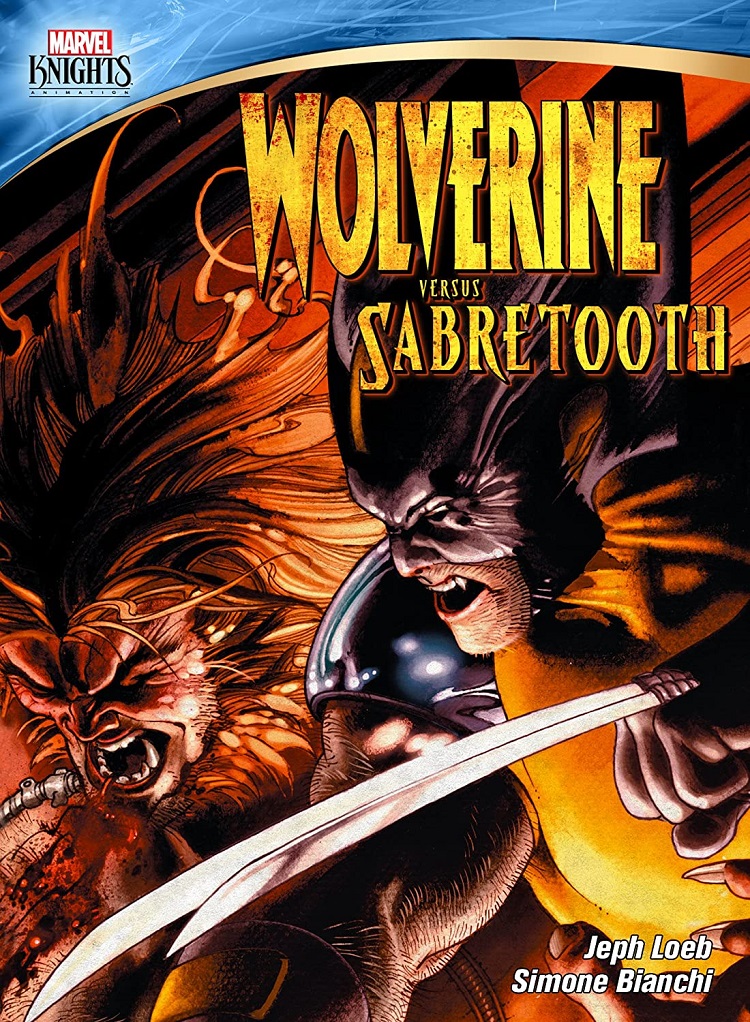
Wolverine and Sabertooth are at the pinnacle of classic comic-book opponents. Jeph Loeb is a reliably impressive writer and TV producer. It stands to reason that this motion-comic project should be a classic, especially since its source comic-book arc marked the return of Loeb to the Marvel writing stable after a lengthy stint at DC. Unfortunately, it’s not, and the blame for that appears to be entirely Loeb’s, although he’s not helped by artist Simone Bianchi’s polarizing art.
Instead of a meaningful story arc that explores the still-mysterious relationship between the two characters, we’re treated to a meandering, dreamy trip through Wolvie’s mind with occasional bursts of fighting. Sure, there’s some hokum about a mysterious early race of warring man-beasts that all originate from a shadowy alpha dog named Romulus, signifying that Wolverine and Sabertooth are somehow both descendants of those beast tribes and Romulus, but the information conveyed is so piecemeal and mystical that it has no impact on the present-day battles between the two foes. For the most part, we’re left with the pair fighting, breaking apart, and fighting some more, a ballet of savagery that continues for the length of the film.
The final fight does end with a very clear champion, but even that decisive conclusion lacks any meaning or payoff due to the lackadaisical story that fails to deliver any worthwhile stakes. In fact, it doesn’t even seem like an ending, which is explained in the bonus features when the creators reveal that it’s really only the halfway point in a story that was concluded years later. Oddly, the bonus features include brief snippets of motion-comic footage from that later project.
As a motion comic, the story is animated well and has passable voice acting, although the production team recycles and even uses mirror images of certain artwork throughout the project, fooling no one. The noticeable recycling seems to expose that the original comic book was too wordy and splash-page heavy, leaving too little artwork to properly animate the story. There are far better Marvel motion comics already on the market, and far better Marvel comic book arcs that could have been used in place of this nonessential tale. This is one to skip, except for the most hardcore fans.
The disc’s bonus feature about the original comic book includes interviews with both Loeb and Bianchi where they discuss their roles on the project and its initial reception in the market. It’s here where Bianchi confesses that his artwork is either loved or hated, with no middle ground. Unfortunately, I’m in the latter camp, finding his artwork to be too dark, garish and abstract to be effective for the story, although admittedly conveying a high level of artistry that might be better suited to a gallery than a comic-book shop.