By any conventional literary measure, the Starseeds series is bewildering and left so far open to interpretation that it’s difficult to derive any meaning whatsoever. The point of view shifts between lightly defined characters, eras, and multiverse galaxies with no clear sense of where the story is going or even if it’s worth the trip. It’s as if Glaubitz is operating on a different plane of existence than the rest of us, making it clear that he’s heavily invested in the story even as he struggles to bring us into his level of consciousness. Good thing this isn’t literature.
In the third and best entry in the series, Glaubitz reaches heights of visual wizardry that seem impossible, particularly in comparison to his rudimentary first outing. Picture cosmic and metaphysical wonders heavily influenced by Jack Kirby’s style, especially patterns reminiscent of his Celestials designs, as well as healthy dollops of Philippe Druillet and Jim Woodring weirdness. It’s like discovering an underground ‘70s sci-fi animated movie transposed to paper, but with far greater mind-expanding properties. This is a work to be savored, with intricate, elaborate splash pages that invite readers to dive in and stay awhile.
It’s difficult and frankly pointless to try to describe the plot, but it involves returning Starseed characters named Indigo, Crystal, and Jaguar as they race around the universe and their minds in a fight to begin, and/or possibly end, new realities. They’re pursued by the evil Illuminati as well as their longtime foe, the Lizard King, as they battle on mental and physical planes. Or just make up whatever meaning you want, but get ready for a psychedelic trip like nothing you’ve ever experienced before.
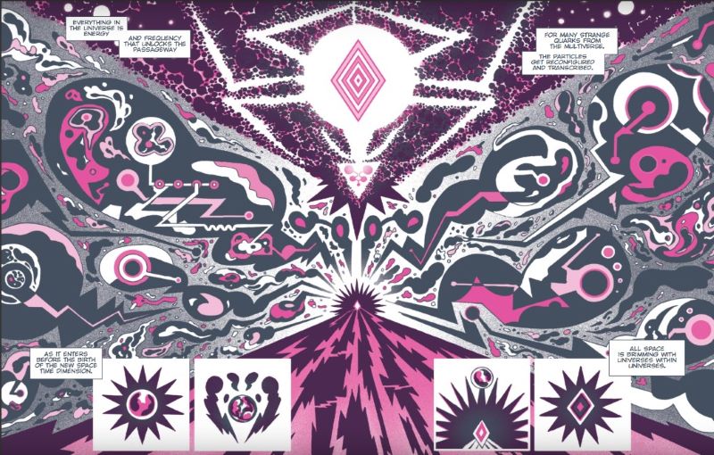
Following the trail set by the first two books, Glaubitz again renders his art in black and white with only one other color. The first book used basic yellow, the second an orangish red, but this time he utilizes a searing dayglo pink that is so vibrant it practically glows in the dark. The digital sample above doesn’t do it justice, it’s far more vivid on paper. Such a bold choice runs the chance of overpowering the rest of the artwork, but here it only amplifies the magnificence of the graphic design.
It’s simply remarkable how much Glaubitz’s artistry has grown over the course of this series. The first book now looks like a zine in comparison, with muddy, poorly separated graphic elements, flat planes of reference, and super loose character models. The second book represented a big leap in quality, and while the jump from the second to the third isn’t quite as dramatic, it’s still far and away the best. Glaubitz works hard on depth of field this time around, imbuing the work with spatial qualities that really enhance reader immersion. Characters have tightened up and become more detailed, and all elements are clearly defined in all panels, even the most bonkers and complex splash pages.
Even knowing what to expect going in, based on my prior experience with the first two books, I left this one stunned beyond belief. Starseeds 3 is a masterclass in graphic design, a cosmic and metaphysical delight that is destined to be a touchstone for decades to come. I still can’t tell you what happened, but I know it blew my mind.