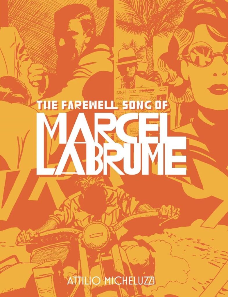
I consider myself to be fairly well versed in the world’s finest cartoonists, and yet prior to this graphic novel, I had never encountered the works of Italian master Attilio Micheluzzi. Fantagraphics plans for this book to be the first in a series of new U.S. editions of his archival works, and based on the strength of this phenomenal debut release, I plan to be first in line for all future volumes.
Buy The Farewell Song of Marcel Labrume by Attilio MicheluzziThe book focuses on the adventures of Marcel Labrume, a renegade French journalist living in Beirut during World War II. In the first of two stories, Labrume meets a daring and mysterious American millionaire named Carol Gibson, suspected of being a spy by the Germans. The pair team up to help a Jewish man escape to Palestine while struggling to suppress their desire for each other. In the final story, Labrume finds himself caught up in the war as a soldier, narrowly avoiding fate as a POW in Northern Africa after escaping and accidentally rescuing a group of Australian women POWs along the way.
Based on the setting and era, the stories read a bit like Casablanca, with expatriates attempting to navigate the new reality of Nazis and their war encroaching in previously overlooked territories. It’s interesting to see the rogue Labrume go from an uninvolved journalist to an enlisted soldier as the war progresses, even as his primary concern remains his own self-preservation. Micheluzzi’s writing is somewhat obtuse, focusing more on seemingly trivial conversations between various players than definitive plot progression. Especially in the second story, we’re never quite sure what exactly is going on, partially a factor of Labrume’s own confusion about shifting allegiances and objectives, but mostly a result of a typically European approach that values atmosphere over linear plot progression.
Frankly, the writing could be complete gibberish and the book would still be great based on Micheluzzi’s incredible black and white artwork. The back cover description compares his style to Milton Caniff and Hugo Pratt, and I wholeheartedly agree. He has the finely detailed lines and superb panel layouts of Caniff’s Terry and the Pirates strips, and yet Pratt’s looser, expressive Corto Maltese brushwork is likely the first comparison that will come to mind as his closest graphic novel counterpart. His shading is also stellar, utilizing both chiaroscuro and crosshatching, often in the same panel, to deliver immersive depth and mood to his masterfully crafted pages.
I’m dismayed that I’ve gone through over three decades of comics fandom without once hearing of Micheluzzi, and I can’t wait to see more of his works in the future.