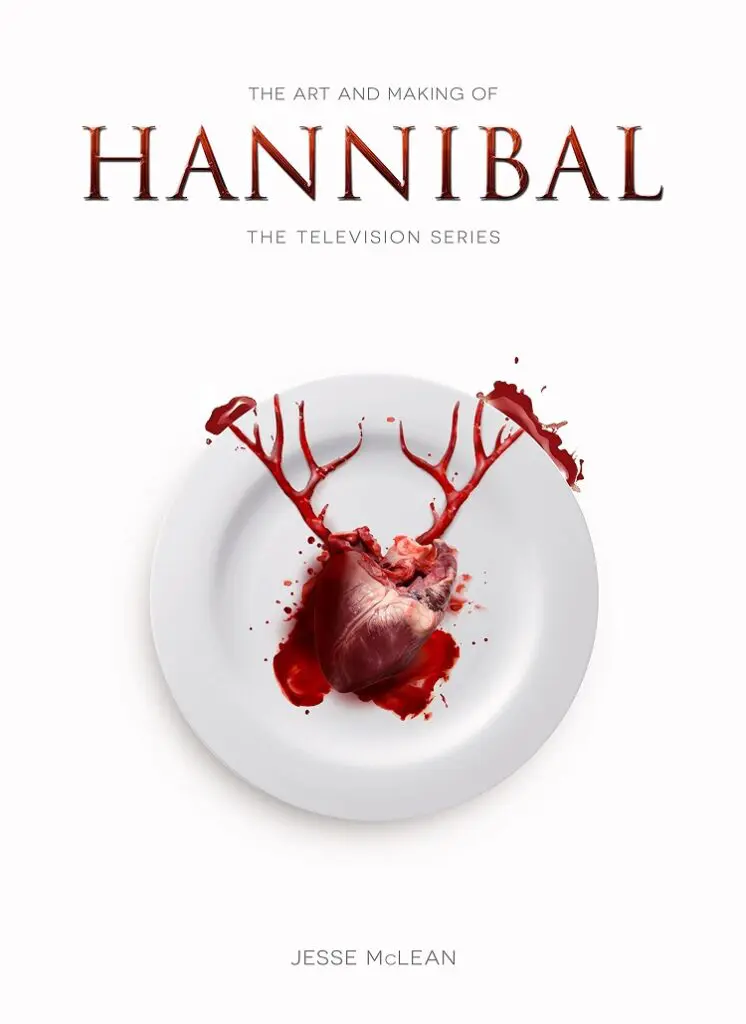
When I first heard about the Hannibal TV show, it seemed like a joke – the apotheosis of the modern reboot culture, where anything could be greenlit as long as someone, anyone had heard of it before. Hannibal the character himself had become very difficult to take seriously – from a figure of real menace in Silence of the Lambs to something more like a regular horror movie monster in the sequels (I haven’t seen Hannibal Rising, but I understand it follows a rather familiar Sympathy for the Devil style storyline – Hannibal is Hannibal the Cannibal because he is sad about his sister and also Nazis).
The last thing the world needed was more of this once powerful now rather silly creation. But somehow the show pulled it off, turning something played out into something fresh, vital, and genuinely horrific. The Art and Making of Hannibal: The Television Series explores how the series was developed, with an emphasis on how its visual effects were developed and achieved.
Written by Jesse McLean, this is an authorized Making Of, with participation from many of the principals involved. It was also written and published before the third season was aired. That means that it contains a lot of mutual praise, and any description of difficulties are of the overcoming-adversity type, not the “these people I work with ruined my vision” variety. I say this not as a criticism, but merely description: this is a book filled with juicy descriptions of production and getting things done, not gossip.
And as a series of insights into a remarkable production, it’s a welcome book, filled with production stills, behind the scenes photographs, and all kinds of details about how the show was made. The main section of the book is split into three categories (labeled after main characters Hannibal Lecter, Jack Crawford, and Will Graham). Each category delves broadly into the characters, with interviews with the actors and show creator Bryan Fuller, and then breaks into smaller articles about specific related elements of the show. For instance, the Hannibal Lecter section has details on the design of Hannibal’s office, how all his wonderful food is created (in real life, where every episode some cook had to decide what animal parts would stand in best for human flesh) and also on the special effects required for some of the terribly grisly murders he commits.
This is where the book goes into the most detail, discussing how various aspects of the show’s sumptuous visual style were achieved. My single favorite thing in the entire second season is probably Randall Tier and his exo-skeleton bear suit, which is happily featured in its own sub-chapter here. Besides concept sketches of the murder suit, and 3d renders, this book shows how the special effects department was committed enough to their craft that they measure the likely bite pattern the mask of the suit would leave, and replicated that on the makeup of the victim’s neck. It’s a detail I certainly don’t remember on screen, but it speaks to the attention to the care that went into the crafting of the show.
In his interview, Mads Mikkelsen, who plays Hannibal Lecter in a very different style than he’s been played before, describes Hannibal as “a reverse person”. He finds beauty in horror, and thinks bad manners is far worse than murder. His interpretation of the character is one of the most interesting things in the show – his Hannibal Lecter is genuinely interested in interesting people, and believes that they should be true to their own nature, however terrible that nature is. It’s a point reinforced by every detail of production, and The Art and Making of Hannibal: The Television Series ably demonstrates this. It’s largely a souvenir for the interested, but a beautifully produced and insightful souvenir.