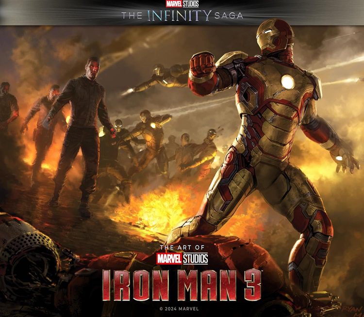
Marvel Studios: The Infinity Saga – The Art of Iron Man 3 is the sixth release in the 24-book Marvel Studios: The Infinity Saga series, which is republishing previously released art books as a resized matching set. In my review, I “highly recommended” Iron Man 3 in part due to its “memorable action sequences,” the development of some are shown in this book’s pages.
Buy The Art of Iron Man 3 bookIn the Introduction, Executive Producer Stephen Broussard says “[Iron Man 3] is the start of something new and bringing something to a close, so it’s trying to do two things at once…[and it] has the burden of being the first post-Avengers movie, to set the tone for what that could mean.” To offset “the spectacular, multiple-character team-up action of Marvel’s The Avengers,” the filmmakers decided to metaphorically “take Tony Stark back to the cave” of Iron Man. They also went back to the Warren Ellis and Adi Granov graphic novel, Extremis, which updated the character for the 21st century and was the source of the first film.
Chapter One looks at new versions of Stark’s Iron Man armor, from the redesigns to Mark VII and the repulsor technology, the Mark XLII, and the new augmented-cognition headset. Chapter Two puts the focus on War Machine, a dark, sleek Iron Armor suit, and the red, white, and blue suit of Iron Patriot, which “are essentially the same design of armor with different paint jobs,” according to effects supervisor Lindsay MacGowan.
Chapter Three starts with a look at the Malibu Mansion Workshop and “Wine Cellar.” There are designs for an an array of alternate suits, which concept artist Andy Park said were developed “with no real restrictions,” so readers get to see suits that focus on weaponry, on power, on uses in different locales. There’s an extended section of storyboards for the Assault on Tony’s Mansion sequence.
Chapter Four is about the villains. The Mandarin wears “several colorful costumes and ten distinctive rings.” The concept drawings start with a generic figure and then begin using Ben Kingsley’s likeness. Aldrich Killian, leader of A.I.M., and his army are infused with Extremis. Concept artist Rodney Fuentebella explains they “had to find ways to make the Extremis effects feel like advanced technology while veering away from something horrific.” Several pages of artwork show their process.
Chapter Five covers different locations of the movie from the Bern Tech Conference, Stark Industries offices, the Mandarin’s Miami Mansion, and Rosehill, Tennessee, where Tony ends up and has to develop weapons without his lab. Another storyboards section covers the Air Force One Rescue.
Chapter Six is about the movie’s climactic battle as the suits of armor from Chapter Three and other versions take on “an army of genetically enhanced Extremis soldiers.” The book presents a three-page spread that shows all 42 versions of Iron Man’s armor. Many fans will spend time poring over this Iron Legion layout and will wish it was detachable because it is suitable for framing. Senior illustrator Josh Nizzi explains concept art was created for a numerous gags “that made logical entertaining use of each armor’s unique abilities.” As with the other books in the series, the final chapter looks at the marketing materials.
Although The Art of Iron Man 3 returns readers to world of Tony Stark for the third time (fourth, if you count the Avengers movie), it feels like a fresh look into it because the script features new armors, new characters, new settings, and a spectacular final battle for the artists to develop, and they did an impressive job. Fans of pre-production art should enjoy what this book contains.