In early 1977, right at the start of the cultural science-fiction boom of the late ’70s, the newspaper syndicate NEA hired Ron Goulart and Gil Kane to do a daily Star Trek-like strip. They came up with Star Hawks about a couple of interplanetary peacekeepers policing the universe from the space station Hoosegow. Inventive for its use of a two-tiered format which made it twice as tall as the usual newspaper strip allowing Kane to create some really interesting artwork.
Goulart is probably best known today for his histories of comic books and pulp fiction, but Kane is a legend in comic-book circles. He drew art for nearly every popular superhero in the 1950s and ’60s and helped create the modern versions of such characters as Green Lantern, the Atom, and Iron Fist. He periodically liked to try new formats including helping create what is now called graphic novels. With Star Hawks, he showed what was possible in a daily newspaper format.
The Star Hawks are a group of intergalactic space cops, two of which are the heroes of the strip. Rex is the handsome, leading-man type who is always charging in to save the day. Chavez is more swashbuckling with a bald head and big hoop earrings who likes busting heads and saving “splendid looking girls.”
The strip is action packed with the boys moving from one adventure to the next with hardly a moment to rest in the Hoosegow before having to head back out and chase another villain, save another girl. Goulart’s scripts are frankly a little hackneyed, never moving past Flash Gordon style action-adventure tales where the villains are snarling and the damsels scantily clad. It would have been nice to see the strip take a periodic contemplative pace as that’s what science-fiction is best at, but I suppose when you are trying to get daily readers, you got to add in as much action as you can.
A lot of Chavez’s dialogue feels patently sexist by today’s standards and there are a few too many beats where he’s telling of one rowdy adventure or complaining that they’re aren’t enough pretty lasses about. Later on in the strip, he gets a bit of a comeuppance when he’s teamed with a female officer who perpetually tosses him on the ground as a reminder he’s to keep his hands off.
It is Kane’s art where Star Hawks shines. The two-tiered system allows for a lot of creative visual storytelling. Where typical comics have a flat three panels, Kane was able to fill up two rows in a variety of ways making it feel more like a comic book than a strip. It often reminded me of one of my all-time favorite strips, Calvin and Hobbes, after Bill Watterson won his fight with the syndicate over allowing him to be more adventurous with his visuals.
Each page simply pops with loads of aliens, spaceships, strange landscapes, and the grandeur of space. Kane tends to almost overload the page with stuff, making the reader pause for a moment to take in all the art he’s created before carrying on with the story.
It was this two-tiered system that also proved to be the strips undoing. Most newspapers fill their comics pages up to the brim and there was rarely a time when they had two tiers opening up to put in one new comic. By the ’70s, newspapers were already perpetually trying to squeeze more comics onto the page hence less space being preferable over something so visually striking as Star Hawks. By 1979, they had changed it to a normal size but by then, the writing was on the wall and the strip died a noble death in 1981.
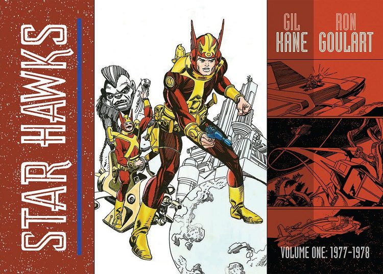
The Library of American Comics has done their usual magnificent job of putting this collection together. Volume One consists of all the Star Hawk comics printed from 1977-1988. It reprints one daily strip to a page allowing Kane’s magnificent art to really shine. There is a very nice essay from Ron Goulart filled with interesting information on how they created the strip and what they intended to do.
Star Hawks is an interesting glimpse into ’70s-era science-fiction comics. Its writing can get a bit tiresome, never stopping to take a breath, but Gil Kane’s art is worth the purchase.